Patagonia – Website and Branding
Blue Heart
Scroll ↓
Client
Patagonia
Role
Design lead (Brand + Interactive)
Year
2018, Produced at Upperquad
Awards
Webby Honoree: Best Data Visualization 2019, Webby Honoree: Corporate Social Responsibility 2019, FWA of the day, Awwwards HM, SOTD, DEV
Design Team
Kailie Parrish, Jessica Strelioff
Blue Heart: The fight for Europe’s last wild rivers is a documentary by Patagonia that aims to spread awareness about the dark side of hydropower in the Balkan region. We created an immersive digital experience that illustrates just how destructive dams can be to the ecosystems and local communities that surround them.

Project Background
The Blue Heart of Europe is a region in the Balkans known for its rich cultural history, biodiversity and its pristine free-flowing rivers. It includes the countries bordering the eastern Adriatic and in Serbia, Kosovo, Macedonia, Bulgaria and some parts of Greece.
Hydropower construction had been threatening the region with more the 1,000 dams already in operation. At the time of the filming, over 3,000 dams were planned to be built in the next few years. It was Patagonia’s mission to spread awareness with the film and it was our task at Upperquad to not only promote the documentary, but also create an informative website to distill the problem and provide a platform to take action.
Discovery
Patagonia had thousands of captivating photos and video clips from ground zero. While we were enamored by the beauty of the region, we also saw the raw scenes of angry protesters, and expressive art installations — all of which inspired the art direction of the site.
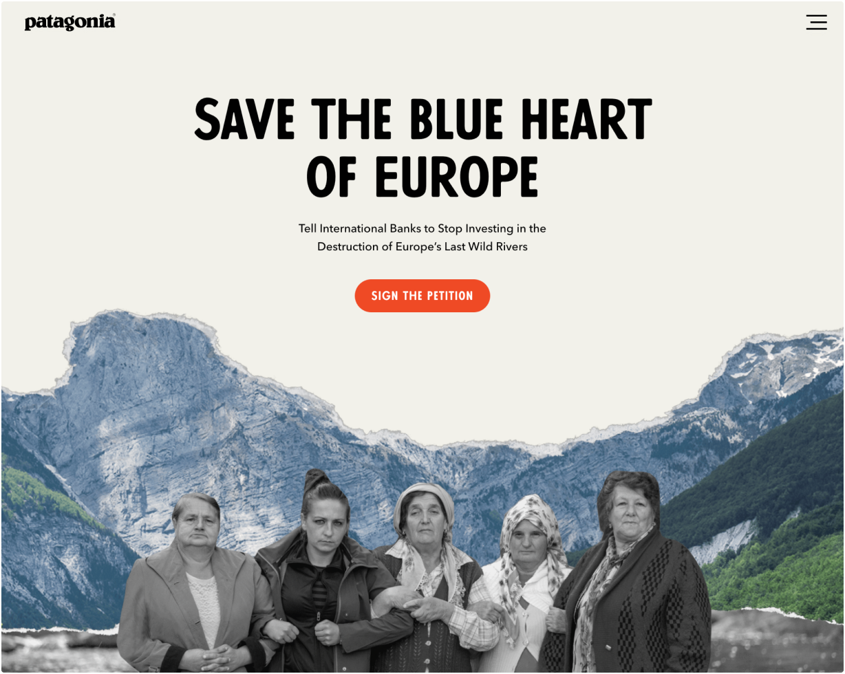
▴ Woman join arms in Croatia
▴ Artist Luka Tomac
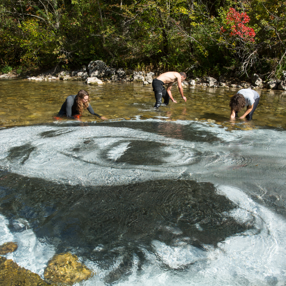
▴ Volunteers set up an art installation in a river in Bosnia

Art Direction
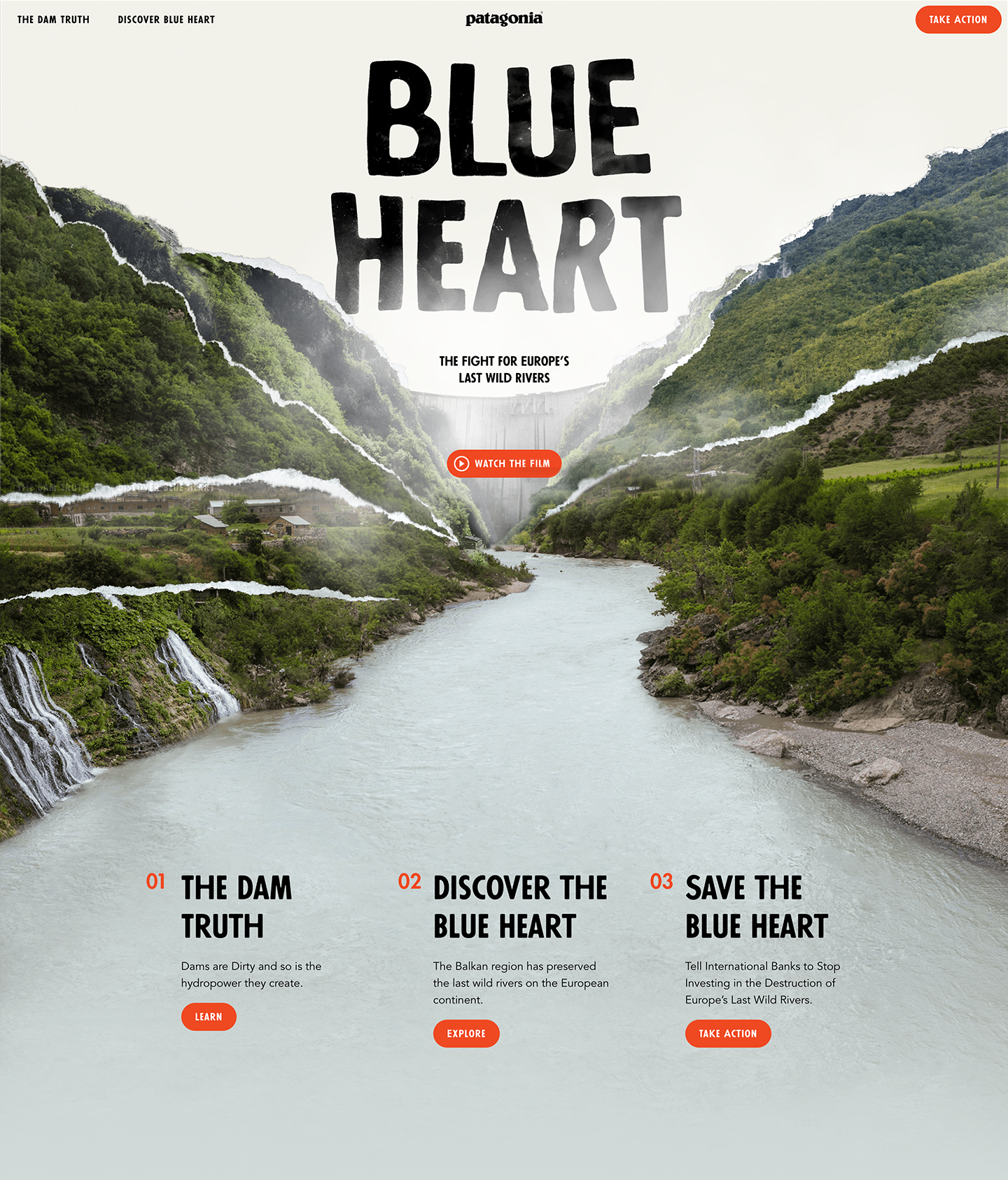
An approach using torn paper was developed to represent the impact on local communities and the fragility of the natural world. The images were all printed, carefully torn apart, scanned back and pieced back together digitally to create the final, fractured scenes.
These powerful visuals were then paired with the font, Futura Passata, for its hand-made look and letter variations.
To align with Patagonia brand standards, Avenir Next LT Pro was kept for body copy and used their red for UI elements to initiate a sense of urgency.
The Logo
For the logo type, the lockup was printed, then submerged underwater to get the desired affects similar to what we saw with Luka Tomac’s underwater art.
The same underwater effect was applied to the logo mark as well. The logo mark was inspired by the map of the balkan rivers and altered to more closely resemble a heart.
The Website
The site was built with layering in mind. The fractured collages come to life with parallax. The homepage is a jumping off point to watch the film, learn more and take action.
The Dam Truth
In addition to the film, Patagonia wanted a space to educate users on the matter. Here, four main points are highlighted following a continues collage path with opportunities to dive deeper into each section.

Discover Blue Heart
We also wanted to highlight the beauty of the Blue Heart region. With a mix of collage, map data, images, video and interviews, users get a variety of information from unique perspectives.


